

Open ten hospital, health-insurance, or pharma websites and seven of them will be blue. Pfizer, Blue Cross Blue Shield, the NHS, IBM Watson Health, Oscar, Babylon, Bayer in various variants, most Polish medical networks — all operate around Pantone 285–300. The question isn’t whether blue dominates medicine. It’s why, and whether it’s still a rational choice for a new brand.
Articles on “color psychology” usually answer that blue “builds trust” and “calms patients.” That’s a simplification that doesn’t survive contact with the actual literature. The real reasons are different — partly physiological, partly industry-specific, partly the result of path dependence. They’re worth disentangling before you start designing a brand for a healthcare client.
Facts: why blue actually took root in medicine
The operating room and afterimages
The strongest argument for blue-green in medicine doesn’t come from branding — it comes from surgery. In the 1920s, American surgeon Harry Sherman pushed for replacing white surgical gowns with blue-green ones. The reason was strictly physiological: staring at red blood against a white background for long stretches produces afterimages in the complementary color — blue-green. Surgeons would look up from the surgical field and see “ghosts” of blood on everything white. Switching the surgical background to a color close to that afterimage eliminates the effect.
This isn’t marketing — it’s receptor mechanics. That’s why scrubs, surgical drapes, and table coverings are still in that gamut today, and why the “medicine” category is already anchored in blue-green in the patient’s mind well before the logo enters the picture.
White is impractical
The second prosaic reason: white shows every stain. A medium-saturated blue is a compromise between “looks clean” and “stays maintainable.” This applies not only to clothing and bedding, but also to walls, furniture, and printed materials in clinics.
Category effect and path dependence
When IBM (“Big Blue”), Pfizer, Blue Cross Blue Shield, and the NHS set blue as the color of medical and insurance institutions in the mid-20th century, every new player faced a simple choice: match the convention and be instantly read as “medicine,” or break with it and explain why you aren’t a “normal” player. Most pick matching — it’s cheaper communicatively. After fifty years of those decisions the convention has grown so dense it has become self-reinforcing.
That isn’t psychology. It’s path dependence — a mechanism well known from institutional economics.
Elimination by negation
In a medical context, the alternatives all have visible downsides. Red is blood, alarm, aggression. Yellow is warning and jaundice. Green carries historical associations with sickness and mold (long before it became “eco”). Orange is too energetic for a context in which death gets discussed. Purple tends to read as decorative and less “institutional.” Blue wins less through the strength of its positive associations than through the weakness of its competition.
Myths worth setting aside
“Blue lowers blood pressure and heart rate”
Cited in countless infographics. In serious literature, the physiological effects of color are small, context-dependent, and often fail to replicate across studies. This isn’t pharmacology, and it shouldn’t be sold to a client as a medical argument.
“Color psychology is a science”
Most of the “blue = trust, red = passion” tables come from marketing books (Eiseman, Wright), not peer-reviewed psychology. Elliot and Maier’s 2014 review shows the field is methodologically very inconsistent. Color associations are largely culturally learned, not innate.
“Blue universally signals trust”
In Western studies — yes, in a significant share of cases. Universally — no. In parts of Iran, blue carries mourning associations. In several Asian and Middle Eastern contexts it carries different connotations (including protective ones). If you’re designing a brand with international ambitions, check the audience’s culture before basing your concept on “universal psychology.”
“Patients heal faster in blue rooms”
Most often repeated as an anecdote or based on small-sample studies. What actually affects clinical outcomes and patient well-being is natural light, access to a window view, and control over the environment — not a wall painted in a shade of blue.
“There’s a Pantone standard for «medical blue»”
There isn’t. The convention clusters around medium-saturated blues near Pantone 285–300, but that’s an industry observation, not a standard. No one has formalized it.
What a specific shade actually does
Generic “use blue” advice is useless. A specific shade communicates something different and positions the brand in a different segment:
- Light, cyan blue — pediatrics, telemedicine, approachable and tech-forward brands. Oscar Health, Babylon, a chunk of wellness apps. Signals “easy,” “fresh,” “modern.”
- Mid “corporate” blue (around Pantone 286) — hospitals, insurers, large networks. “An institution you can trust.” The most generic and the safest choice — also the most anonymous.
- Navy — premium, traditional medicine, private clinics. Mayo Clinic and Cleveland Clinic flirt with this register. Signals expertise and seriousness.
- Blue with a warm accent (coral, salmon, orange) — a deliberate “we’re not the old hospital” signal. One Medical, Forward, much of the last decade of digital health. Breaking the convention in a controlled way.
These are positioning decisions. The choice of shade carries strategic, not aesthetic, weight.
When to break the convention deliberately
Blue is a rational, low-risk choice when the brand needs instant categorization: the patient lands on the website, knows within a second this is healthcare, and continues from that assumption. That’s a value worth holding onto unless you have a specific reason to give it up.
Reasons do exist, and they’re getting more common:
- The brand wants to read as wellness or lifestyle, not medicine — natural greens, warm beiges, sometimes terracotta. Headspace, Calm, a lot of mental health brands.
- The brand targets children or parents — yellow, coral, mint. The medical convention would be counterproductive because it would evoke hospitals.
- The brand wants to break with the “cold institution” image and communicate closeness — warm pastel palettes, lots of white, and photography featuring real people.
- The category is so saturated with blue that any other color gives instant differentiation. This currently works particularly well in digital health and premium private medicine.
The rule is simple: break the convention if you know what you’re gaining and whether you’re willing to pay the cost in longer audience education. Breaking the convention without that calculation is aesthetics, not strategy.
How to think about this when designing a medical brand
A few questions worth asking a healthcare client before you start any design work:
- Should the audience recognize the category in one second, or distinguish the brand from the rest of the category? Those are two different strategies, and two different palettes.
- Is the brand institutional, premium, approachable, or “anti-hospital”? Each position has a different dominant shade.
- Are you operating only in Poland/EU, or internationally? Cultural associations differ.
- What’s the patient’s point of contact with the brand — physical reception, app, telemedicine? Digital and physical palettes have different constraints (contrast, print, building materials).
A good medical brand doesn’t pick a color “because blue is calming.” It picks a color as a consequence of positioning decisions, and it knows the real reason blue became the industry standard in the first place.
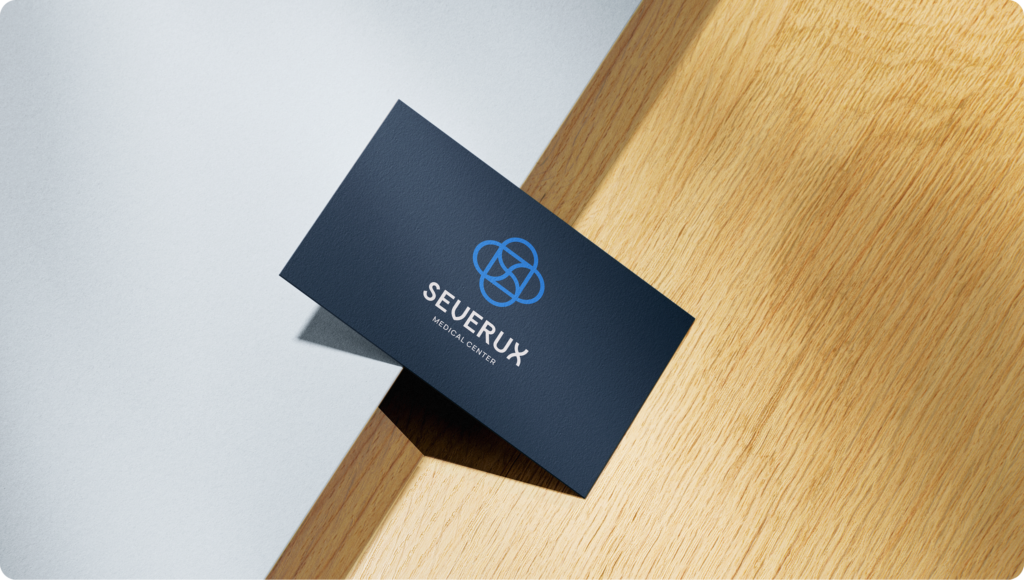
Worked example: Severux
To show this on a real project — we recently built the Severux brand, a private medical center operating in Chorzów and Świętochłowice (Silesia, Poland), specializing in diagnostics, radiology, and specialist care. The project covered the identity from scratch: logo, visual system, and WordPress website.
The brief came down to the tension we described above in this article. On one hand, the client needed the patient to recognize the category instantly — this is medicine, this is where I’ll get my imaging done, I can trust them. On the other hand, Severux isn’t a public hospital or a large chain — it’s a private center with a patient-first approach and an empathetic team. The brand had to simultaneously communicate diagnostic precision (radiology doesn’t tolerate a loose tone) and approachability (the patient shouldn’t feel like they’re in a 1980s neighborhood clinic).
From this article’s framework, that meant two answers to the four checklist questions above:
- Category recognition vs differentiation from the category — a mixed answer. The patient has to know within a second that this is medicine (the conventional signals are preserved), but private diagnostics in Silesia is a crowded competitive field, and going purely generic “corporate blue” would have been a wasted opportunity.
- Institutional vs approachable — a shift toward approachability, but without sliding into wellness territory. Imaging diagnostics requires seriousness.
The palette in practice
The system is built on six colors plus white, with distinct roles in the identity:
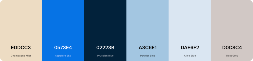
- Prussian Blue — brand foundation. Deep navy that anchors the identity and signals seriousness and expertise (the “navy” register from the framework above).
- Sapphire Sky — mid-range blue used as the interface accent. Carries the digital, modern signal. Applied to CTAs, key UI states, and important highlights.
- Powder Blue and Alice Blue — very light surface tones. They give the system breathing room, reduce visual stress on long, text-dense medical pages, and keep the experience from feeling crowded.
- Champagne Mist — the warm accent. Cuts the cold of the blue tones and pushes the brand toward “human-centered” rather than “cold institution.” This is exactly the move described above under “Blue with a warm accent.”
- Dust Grey — a functional neutral with a slightly warm cast (not a pure grey), tonally consistent with Champagne Mist. Supports readability, structures hierarchy, and holds the layout together without competing with the blues.
As a whole, the palette communicates four things simultaneously:
- trust and professionalism (the foundation in the conventional medical register),
- modern, technology-aware care (the digital-feeling mid-blue),
- patient comfort (the light surface tones and the warm accent),
- premium positioning — but accessible, not corporately distant.
In practice this is the “blue with a warm accent” pattern from the framework, executed at the scale of a complete identity system rather than as a single accent color. The patient on the Severux website gets an experience that is at once clearly medical, modern, and noticeably more “human-centered” than most Polish clinic identities.
The result: a coherent brand system in which the patient gets a clear category signal, and the clinic gets a tool for scaling communication across locations and channels (from the website to printed materials at reception). The full scope of the project — from logo through identity system to WordPress implementation — is available in the Severux case study.

Worked example: InCare
The second project from our portfolio shows what the framework looks like in a different market context. InCare Medical Center is a full-service medical center in Gliwice (Silesia, Poland) with a team of over 25 specialists across more than a dozen outpatient practices (allergology, gynecology, surgery, pediatrics, dermatology, endocrinology, ENT, psychiatry, pediatric neurology, nutrition, diabetology, family medicine). The brand operates locally, in partnership with PZU, Allianz, and POLMED.
It’s a different operational category from Severux. Severux is narrowly specialized (diagnostics, radiology) and competes with other private diagnostic facilities in the crowded Silesian market. InCare is broad-spectrum — the whole family, every stage of life — and doesn’t need to fight for patient attention through brand, only through clear offer presentation and smooth conversion. A patient on the InCare site is looking for a specific specialist or specific service (an ultrasound, a screening, a consultation) and needs to book a visit in three clicks.
From this article’s framework, those are four answers to the four checklist questions above, each different from Severux:
- Category recognition vs differentiation — strongly category recognition. The patient doesn’t have the time or appetite for “brand experience” — they need to know quickly that they’re in the right place and get to booking a visit.
- Institutional vs approachable — approachability supported by elements of institutional trust. Insurance partners (PZU, Allianz, POLMED) act as social proof. The brand communicates “professional, holistic care” built on three pillars — diagnosis, therapy, prevention. That’s a narrative of care, not research expertise.
- Reach — strictly local, Gliwice. All communication targets a patient from the region, including SEO-friendly URLs (“alergolog-gliwice,” “dermatolog-gliwice”).
- Patient touchpoints — extensive digital infrastructure: online booking, phone number permanently visible in the header, dedicated subpages per practice, per specialist, and per procedure. This is a transactional project (book a visit) more than a branding one (build recognition).
In practice this means a different set of design priorities. For Severux, what mattered was brand differentiation in a crowded competitive field — hence the refined palette with a warm accent. For InCare, what mattered was site conversion and offer clarity. The visual identity has to work discreetly in the background, signal trust, and get out of the way of a patient who has a goal.
The palette in practice
Four main colors with specific roles in the identity:

- Deep Space Blue — brand foundation, navy in the medical convention. Typography, headers, system frame.
- Ocean Blue — primary, interface accent and the first brand pillar: Diagnosis.
- Dark Cyan — secondary accent, the second pillar: Therapy.
- Berry Crush — warm accent, the third pillar: Prevention. A deliberate choice — it breaks out of the cold blue-green tones and communicates the human side of the brand: patient education, long-term health, partnership.
Each of the three accent colors (Ocean Blue, Dark Cyan, Berry Crush) has not just an aesthetic function but a specific narrative role — it marks one of the three pillars of the offering. That’s what distinguishes the InCare palette from a typical “decorative” color set: every shade means something, every shade works somewhere. A patient browsing the site gets a visual system that helps them understand the offering before they even read the content.
The project covered the logo, identity, a dedicated WordPress template with an online booking system, information architecture for ~25 doctors and a dozen-plus practices, responsiveness, and integrations with partners (Lab-Med, insurers). Full scope: InCare case study.
Two strategies in practice: Severux and InCare
The framework from this article can be applied in different, equally valid ways. Two projects from our portfolio show that spectrum — one departs subtly from the convention with a warm accent, the other reinforces the convention with distinctive color accents.
Severux — a subtle departure from the convention
A private diagnostic and radiology center. Navy as the foundation (the “navy” register) reinforced by a warm accent that breaks the cold of the blue tones. Full analysis above.
Palette: Prussian Blue · Sapphire Sky · Powder Blue · Alice Blue · Champagne Mist · Dust Grey.
InCare — the convention reinforced by accents
A full-service medical center in Gliwice (Silesia, Poland) with a team of over 25 specialists and a dozen-plus practices (partners: PZU, Allianz, POLMED). A different goal from Severux — not differentiation, but offer clarity and conversion: the patient is looking for a specific specialist and needs to book a visit in three clicks. A foundation in the medical convention (navy + bright blue) reinforced by two distinctive accents (rose + teal).
Palette: Deep Space Blue · Ocean Blue · Berry Crush · Dark Cyan.
The full scope of the project — logo, identity, WordPress template with an online booking system — is available in the InCare case study.
Summary
Blue dominated medicine for three real reasons: the physiology of the operating field, practicality in maintenance, and a path-dependent effect cemented by five decades of decisions made by major players. The “psychological” argument is weak, and it isn’t worth building client recommendations on it.
Picking blue for a medical brand is rational, but it isn’t the only rational choice. The convention has grown dense enough that a deliberate departure from it works more often today than it did a decade ago — provided the departure is intentional, justified by positioning, and carried through the identity consistently.
Working on a healthcare brand and need a technology partner to implement the visual identity — from logo and brand system to website, booking system, and patient panel? See how we built the Severux brand from scratch, or get in touch — we design and ship websites and applications for professional medical brands and private clinics.


