
Most color presentations I’ve sat through go roughly like this. The designer shows three palette directions. The founder leans back in their chair, stares at the screen for about ten seconds, and says: “I don’t like that blue.”
That’s the entire feedback. That’s the entire reasoning. One visual element that will appear at every customer touchpoint for the next several years: on the homepage, on invoices, on packaging, on the LinkedIn banner, on the team’s hoodies at trade shows. The decision gets made in a single sentence of personal taste.
I don’t blame founders for this. Color seems obvious. You see it, you react, you express the reaction. What’s there to talk about? Except that after enough rebrands and redesigns, you start to see a pattern: color decisions that actually work, that hold up through five years of company growth, that print correctly on every substrate, and that mean the right things in the markets you actually sell into, almost never come from a gut feel.
This article is about what hides beneath that intuition. Not so the founder starts doing the designer’s job, but because the conversation between you and your design team gets a lot better when both sides understand what they’re actually deciding.
Color isn’t paint
Here’s something almost nobody mentions when handing you a hex code: the color you experience doesn’t exist in the object you’re looking at.
When you see “red,” what’s actually happening is this: white light, a mix of electromagnetic waves of different wavelengths, hits a surface. The surface absorbs most of those waves and reflects the rest. The reflected waves hit the cones in your retina. Three types of cones, each tuned to a different range of the spectrum, send signals to the brain. The brain assembles those signals into the experience of “red.”
Isaac Newton worked this out in 1704. He split white light with a prism, observed its component wavelengths, and concluded that color is a property of light, not of the object. He picked seven colors for his color wheel (red, orange, yellow, green, blue, indigo, violet), in part to match the seven notes of the musical scale. Indigo sits in that list more for numerological reasons than visual ones.
That sounds like a historical footnote, but it has practical consequences for every branding decision you’ll make: the same brand color looks different in every medium, because every medium produces color differently.
Three models, three different worlds
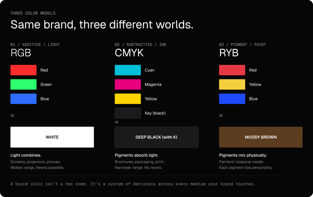
Designers work with three color models. Most clients have heard of one. The differences aren’t pedantic. They’re the reason your brochure looks duller than your website, and your t-shirt looks duller than your brochure.
RGB is light. Screens, projectors, phones, anything that emits its own light. The model is additive: red, green, and blue light combine into white. The more light you add, the brighter and more luminous the color. RGB has the widest color range of any model. It can render neons, intensely saturated colors, and the kind of luminosity that only exists on backlit screens. When you type #1E4BFF into CSS, that’s RGB.
CMYK is print. Cyan, magenta, yellow, and black ink on paper. The model is subtractive: pigments absorb light and reflect what’s left. Combining cyan, magenta, and yellow doesn’t produce true black, which is why a fourth color, black (K), is added. CMYK has a narrower range than RGB. It can’t reproduce neons. It can’t reproduce the luminous saturation of a backlit screen. That same brand blue that practically glows on your website will look noticeably more muted on a business card. That’s not the printer’s mistake. It’s physics.
RYB is paint. Red, yellow, and blue pigment, the model used by painters for centuries. It’s a different subtractive system than CMYK, with its own logic and its own limitations. Pigments mix physically; with too many components the color gets “muddy.” The result depends on pigment quality, opacity, granularity. Ultramarine has a different character than phthalo blue, even at the same hex code. Most agencies don’t work with RYB unless they’re producing physical products, packaging, or hand-painted signage. But if your brand has any physical presence at all, someone in the supply chain is thinking in pigments.
Why this matters: a brand color isn’t a hex code. It’s a system of decisions about how that color renders in every medium where your brand will appear. A good design partner gives you not one number but a small set: an RGB value for screens, a CMYK conversion for print, a Pantone reference for spot printing on packaging or merch, and sometimes a specific paint code for physical spaces. If you walk out of a branding process with just a hex code, you don’t have a brand color. You have a guess.
Hue, saturation, lightness. The three knobs that actually exist
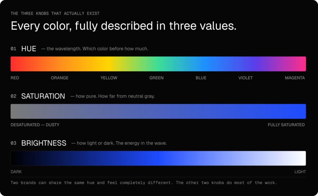
When designers work on a palette, they don’t think in hex codes. They think in three dimensions, because every color you can perceive can be fully described by three values:
Hue is wavelength. It’s what people usually mean colloquially by “color”: red, blue, yellow, green. It answers the question “which color?” before you start asking about anything else.
Saturation is the purity of the color, how far it sits from a neutral gray of the same lightness. Fire-engine red is highly saturated. Dusty pink is the same hue with most of the saturation pulled out.
Lightness tells you how light or dark the color is. In physical terms: how much energy the wave carries.
Once you understand those three knobs, a lot of design-presentation vocabulary stops being mysterious. When a designer says the complementary color is “the same blue, just less saturated,” that’s a precise statement, not a vague gesture. When they say a color “doesn’t have enough contrast” with the background, they’re talking about lightness, not hue. When they show you a palette and explain that the muted versions are for backgrounds and the saturated ones for accents, they’re not being picky, they’re applying a rule that makes interfaces work.
Another thing worth knowing: hue and color aren’t the same thing. Hue is just wavelength. Color is the full experience: hue plus saturation plus lightness plus context plus the conditions under which you’re looking. Paint manufacturers use the word “hue” specifically to signal a substitute pigment: “cadmium yellow hue” means a non-toxic, often cheaper pigment that hits the same hue as real cadmium, but it isn’t the same color. The distinction matters in branding too. Two brands can use the same hue and produce completely different impressions because one keeps saturation low and the other high.
What color psychology research actually says
Here I have to be careful, because color psychology belongs to a category of topics where the popular narrative is 80% myth and 20% real research. And the myths get repeated very confidently by people selling courses.
What research generally supports:
- First impressions form fast. Aesthetic judgments about a page or product form within roughly 90 seconds, and color plays a substantial role in that judgment. The exact number varies between studies, but the direction is consistent: fast judgments are real, and color is part of them.
- Color influences mood and arousal. This is well-documented at the population level. Warm colors tend to activate, cool colors tend to calm, and certain contexts (like blue lighting in hospitals versus orange) measurably affect stress responses.
- Color influences purchase intent, but rarely directly. It works through mood, attention, and perceived price segment. More saturated palettes catch the eye on the shelf, muted ones signal a higher segment, and an inconsistent palette across a single touchpoint (online store vs. packaging vs. ad) erodes trust faster than any copywriting can repair. Numbers floating around marketing blogs (“85% of purchase decisions are made based on color”) are usually pulled out of context or made up, but the direction is right.
- Color helps differentiate brands and signals price segment. A luxury brand using saturated, kindergarten primary colors is fighting itself. The market has trained consumers to read certain palettes as expensive and others as cheap. You can’t opt out of that signal.
- Color preferences aren’t random. They come from associations with the environment. Stephen Palmer and Karen Schloss at Berkeley described this as ecological valence theory: we like colors associated with things we like, and dislike colors associated with things we don’t. Blue, the most commonly reported favorite color, wins not because there’s anything magical about it but because that’s what a clear sky and clean water look like. Muddy brown-yellow tones rank low because they trigger associations with rot, illness, bodily functions. This sounds trivial, but it has a concrete consequence for branding: the established color associations in your category (navy in banking, green in organic food) aren’t innate. They’re learned. You can work with them, work against them, or redefine them, but you have to know they’re there and where they come from.
- Preferences shift with age and economic status. Children consistently prefer saturated, vivid colors; adults shift toward muted ones. After age sixty, the lens of the eye yellows and measurably changes perception, especially of blue and yellow tones. That’s not aesthetics, it’s physiology you can’t ignore if your target audience is older. With income, the correlation runs counter to intuition: higher market segments consistently choose reduced palettes, black-and-white, or monochromatic. “Discretion” is a positional status signal. A brand trying to sell into private banking using Mailchimp colors is fighting a reflex its customers have been practicing their entire adult lives.
- Preferences also vary by gender, though more weakly than by culture. Hurlbert and Ling (Current Biology, 2007) and subsequent replications show that women more often prefer hues toward red and pink, men more often toward blue. The difference is measurable, but the overlap between the two groups is large, and the interpretation is contested: some researchers reach for evolutionary explanations, most point to socialization. Pink only became “a girls’ color” in Western culture in the 20th century; earlier it was considered a masculine variant of red. Conclusion for branding: if you’re targeting a strongly gendered audience, it’s worth testing with your own customers. But don’t build a brand around this difference. The effect is real, but weak compared to culture, age, and context.
What research does not support:
- “Red means urgency, blue means trust, green means money.” These oversimplifications are everywhere on marketing blogs, but the actual associations depend heavily on culture and context. Blue is associated with trust in American banking partly because so many American banks chose blue. Cause and effect run both ways.
- A universal mapping from colors to emotions. A few weak universals exist (people across cultures often respond to red as arousing), but most associations are learned, not innate. Treating them as innate is a route to a brand that feels generic on its home market and confusing abroad.
The honest version: color influences people, but that influence is mediated by context, culture, and what competitors in a given category have conditioned the audience to expect. Color choices should be grounded in research, but the research that matters is research on your customers, not on “people in general.”
Culture is bigger than psychology
This is the part most underrated by US companies that haven’t yet shipped to other markets.
Color carries cultural meaning that varies enormously by region:
- White is associated with weddings, purity, and minimalism in Western culture. In most of East Asia, it’s associated with funerals and mourning. Among Inuit communities, who live in an environment where white dominates most of the year, the color has a rich aesthetic vocabulary and appears in art and ceremonial clothing as a full color of expression, not a background.
- Red is festive in China and parts of Southeast Asia. In Western interfaces, it’s a warning color. Both can be true at once.
- Green signals ecology, money (in the US), and Islam. It was also important to the ancient Celts. Use it for an eco brand selling into Saudi Arabia, and you’re sending two signals at once, fine if that’s the intent, a problem if it isn’t.
- Orange is the color of Dutch national identity, of Hindu monastic robes, and of prison uniforms in the US. Same hex code, three completely different histories.
- Red paired with white in many Melanesian cultures is a sacred combination: it appears in initiation ceremonies, body painting, and ritual objects. The same contrast in Western retail signals a sale or a holiday end-cap. A third context, the same set of colors.
Even the metaphors embedded in language show that color carries cultural weight. In English, feeling blue means sad. In Spanish, el príncipe azul (the blue prince) is the equivalent of “Prince Charming.” Same color, opposite emotions. In Polish, the idiom myśleć o niebieskich migdałach literally means “to think about blue almonds”, in other words, to daydream. Translate any of these phrases literally and you get nonsense.
If your brand will operate in more than one market, the designer has to be thinking about this from day one. Not as a constraint, just as information. Some of the strongest international brands have palettes specifically engineered to skirt the most strongly loaded color associations in their target markets.
What a bad color decision costs your brand
Assuming color can be easily changed later is cheaper than the consequences of that assumption. Changing a color post-launch isn’t a palette update. It’s a rebrand. And rebrands cost time, money, and lost recognition. Two canonical examples worth knowing:
Tropicana, 2009. PepsiCo commissioned the Arnell Group for a high-profile packaging redesign: simplified typography, an abstract image of a glass of juice instead of the iconic orange with a straw, and reduced prominence of the logotype. The new look hit shelves in January. By the end of February, sales had dropped about 20%, translating to losses in the tens of millions of dollars. PepsiCo pulled the new packaging and reverted. It wasn’t just color, it was the entire visual system, of which color and composition were a central part. Customers couldn’t recognize the product on the shelf.
Gap, 2010. The clothing retailer rolled out a new logo: a white square with a small blue square in the corner. Online criticism arrived the same day. After six days, Gap pulled the project and reverted to the original blue logotype that had served the brand for more than twenty years. One of the fastest rebrand reversals in branding history.
The lesson isn’t that you shouldn’t take chances. Brands have to evolve. The lesson is that a color decision made on the basis of “I don’t like that blue” has real costs if it turns out to be wrong. A mid-sized B2B company isn’t going to go bankrupt over a bad palette, but it will lose quarters explaining to customers why it looks different, instead of selling.
How we build a brand color strategy at Less Code
We don’t pretend that choosing colors is hard science. It’s a series of decisions grounded in research, market analysis, and a fair amount of trial and error.
The process we run with clients, simplified:
We start with strategic position. Not “what colors do you like,” but “where does your brand sit in its category, and what does the competitive palette look like?” If you’re entering a category dominated by navy and white, you have a choice: blend in and compete on something else, or pick a deliberately distinctive palette and compete on distinctiveness. Both approaches are valid. Accidentally blending in with the competitor palette isn’t.
We then ask about brand lifespan and price segment. A campaign meant to live three months can safely take a trendy “color of the year,” because it’ll be gone before the trend gets stale anyway. A company identity meant to last ten years has to ignore that temptation. Very Peri from 2022 looks like expired yogurt today; the same color in the identity of a company that just signed a five-year contract with a major client is an unplanned rebrand commitment. Price segment works similarly: higher segments demand palettes that don’t look cheap across the full product life, which usually means fewer colors and lower saturation. A cheap brand trying to look expensive gives itself away in the opposite direction: it adds gradients, it adds colors, it adds glows. Less usually reads as more expensive.
We define the leading color before anything else. Not a palette, one color. The one that has to do the most work, that has to be recognizable as yours after three customer touches. We test it in the media where the brand will actually exist, including the ones founders forget about: the inside of an email footer, the corner of a marketplace listing, the OG image preview scaled down to a LinkedIn thumbnail.
Logo work intensifies this to the limit. The logo is where color most often appears as the only legible element of the brand: a 16×16 favicon in a browser tab, an avatar in a comment thread, an app icon in a dense home-screen grid. Shape often disappears at that size; color stays. That’s why choosing a color for a logo isn’t cosmetic, it’s a decision about how quickly customers register that it’s you again.
A poorly chosen palette creates friction a customer can’t name but feels. A bank in orange that looks like fast food. A medical app in a gradient lifted straight from a fintech startup deck. A premium brand in colors that suggest gaming. The customer doesn’t think “I don’t trust this palette.” The customer thinks “something’s off here,” closes the tab, and doesn’t come back. Our work is to make sure the palette signals the category you actually want to compete in, not the one a graphic trend from last year pushed you toward.
We build the supporting palette around the leading color, not parallel to it. Complementary and accent colors are defined by their relationship to the leading color: they support it, contrast with it, extend it. A palette in which every color fights for equal attention isn’t a palette, it’s a circus.
We deliver the color system as a system, not a stack of swatches. RGB for digital. CMYK for print. Pantone for spot printing. Combinations checked against WCAG for accessibility (this is non-negotiable; if text and background don’t meet minimum contrast, the page is unreadable for a meaningful portion of your audience and exposes you to legal risk in certain jurisdictions). Tokens for light and dark mode where applicable. Rules for which color can sit on which background.
That’s the difference between getting a hex code and getting a brand. Copying a hex code costs nothing. The system is what survives a year of marketing campaigns, three new product lines, and expansion into a market where the founder’s color preferences don’t translate.
Accessibility isn’t aesthetics, it’s law
I mentioned WCAG in passing in the color system section, but the topic deserves its own moment, because most founders find out about it at the worst possible time: when somebody files a formal complaint, or a compliance audit hands back a report flagged red.
WCAG (Web Content Accessibility Guidelines) is the international standard that defines the minimum contrast between text and background a page has to hit to be readable for people with low vision, various forms of color blindness, and anyone reading in sunlight on a phone. Three levels: A (minimum), AA (the standard target), AAA (the highest). Most regulations require AA.
Specifically: regular text needs a minimum contrast of 4.5:1 against the background. Large text (18pt, or 14pt bold) needs 3:1. These are numbers you can verify automatically, in seconds, with free tools (WebAIM Contrast Checker, Stark, Figma plugins).
What this means in practice: that light-gray text on white that your designer set because “it looks elegant” probably has a contrast of 2.8:1 and is out of compliance. That light-blue button with white text? Same. Your brand palette can be beautiful and at the same time unreadable for eight percent of men (red-green color blindness) and a significant share of people over fifty.
The legal frameworks behind this are real:
- In the European Union, the European Accessibility Act took effect on June 28, 2025. It covers e-commerce websites and apps, banking, transport, telecommunications, and several other sectors. Non-compliance carries the risk of penalties imposed by national regulators.
- In the US, WCAG 2.1 AA is a de facto requirement under ADA Title III. The number of lawsuits brought on this basis grows year over year. The Department of Justice formally adopted WCAG 2.1 AA for state and local government websites in 2024.
- In most EU member states (and in the UK under the Equality Act), accessibility standards apply directly to the public sector and become a contractual requirement for any business working with government or universities.
From a color-decision standpoint, accessibility is a filter we apply before the client ever sees the palette. There’s no point falling in love with a combination that will then have to be rejected because blue on green doesn’t meet AA. Better to narrow the field upfront than to come back to the project after three rounds of revisions.
What to ask your design partner
If you’re approving a brand right now, or feeling frustrated with the one you have, here are the questions that will give you a better conversation than “I don’t like that blue”:
- What is this color doing strategically? What does it signal about category, price segment, and brand personality?
- How does it look in CMYK? Show me a printed proof, not a screen mockup of the print.
- Where do we stand on accessibility? Which color combinations meet WCAG AA? Which don’t, and where will they get used?
- How will three of our most important international markets read this color? Are there associations we should know about?
- What’s the rule for using the secondary palette? When does this color appear, and when does it not?
If a design partner can answer these clearly, you’re working with someone who understands what a brand color actually is. If they can’t, you don’t have a brand system. You have a stack of swatches.
Color isn’t decoration. It’s the most-used element of your brand, the one that does the most work on the smallest surface, and most often the one that gets decided by accident. Treat it accordingly, and ask the questions that force the decision to actually be a decision.

